

Project
Seattle pinball museum
The Seattle Pinball Museum’s current website is confusing to users and difficult to navigate. My task was to redesign the existing website to help aid users with their needs as well as the clients needs.
UX Design
Winter 2019 - 10 days
Intro
The Seattle Pinball Museum was born from a desire to share the games with other local collectors. The concept is to provide vintage pinball machines as an interactive display of kinetic art. Their website doesn’t showcase the museum and is difficult for users to navigate.
Process
Research Methods
I conducted research methods to understand the user and the pain points with the current website.
Persona
Our User
Parents

Characteristics
Age 22-50
Has multiple children
Brings family to Pinball Museum for family entertainment
Pain Points
Difficult to find general information (hours, price, location)
Can’t purchase tickets online
Not pleasant to look at or engaging
Needs
To purchase tickets online
To find out about new events
Know general information (hours, price, location)
Analysis
Competitive Analysis
Compared the Seattle Aquarium, Mo-Pop, The Living Computer Museum, and Pacific Science Center
All websites home page features new exhibits, general information (hours, price, location), and ability to purchase tickets online.
Main focus is to get patrons to visit and purchase tickets online.

Navigation
Site Map
I created a site map for the new website. Due to time I focused on the main navigation.

Iteration
Skecthes
Made sketches and a paper prototype to test with users.
Insight
Logo as home button and tested best when in upper left corner.
Tried a variety of places for general info (price, hours, location) and tested best down under the buy tickets button.
Users found the top of the screen visually cluttered when primary navigation was lower on the screen.

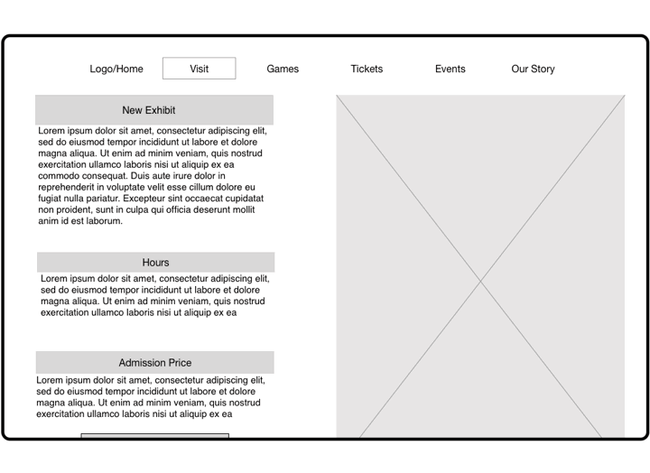
Wireframes
Created wireframes to test with users
Insight
There was a lot of copy on all the pages. Needed to work on the format and add more images, so users wouldn’t be confronted by a wall of text
Sizing was off for the features on the home screen.
First Iteration


Second Iteration

Iteration
Insight
Visuals
Continued work on the website after the initial time frame of the project to add the visual components.
Created a darker and fun design to match the style and feel of the Museum.
Moved away from having blocks of text and images. Instead thought of the layout as a series of small screens connected as you scroll.


Takeaways
What I Learned
The importance of user testing in each phase of the iteration process
The importance of interviewing users to help prioritize the information that the user will need
How to navigate and build a website


